Luxsam
An online store for a long established Trinidad and Tobago company that sells electronics, medical equipment and office furniture, and services Samsung products. We designed a store in its blue and red, with a Samsung hero slider, a clear services section with a repairs inquiry form, brand logos and a latest products carousel.
- Client
- Luxsam Industries
- Industry
- Electronics and equipment
- Specialism
- Samsung service centre
- Style
- Blue and red
- What we did
- Store design
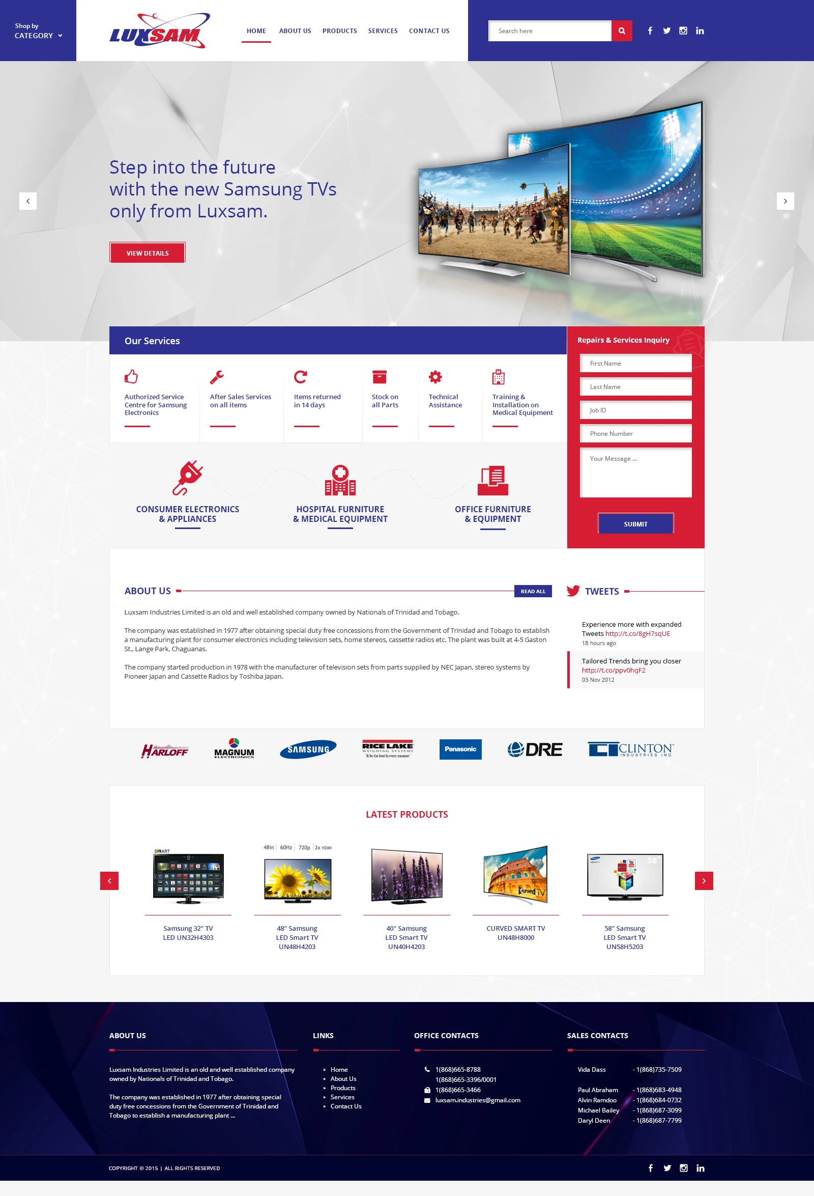
The brief
Luxsam Industries is a Trinidad and Tobago company established in 1977. It supplies consumer electronics and appliances, hospital furniture and medical equipment, and office furniture and equipment, and it is an authorised service centre for Samsung electronics.
The design had to put the three product lines and the service offer in front of visitors straight away, make a repairs request easy to send, and show the brands and products behind the company.
A header in three blocks
A blue Shop by category menu sits on the left, a white block in the centre holds the logo and five links, and a blue block on the right holds a search field and social icons. A red line under Home marks the current page.

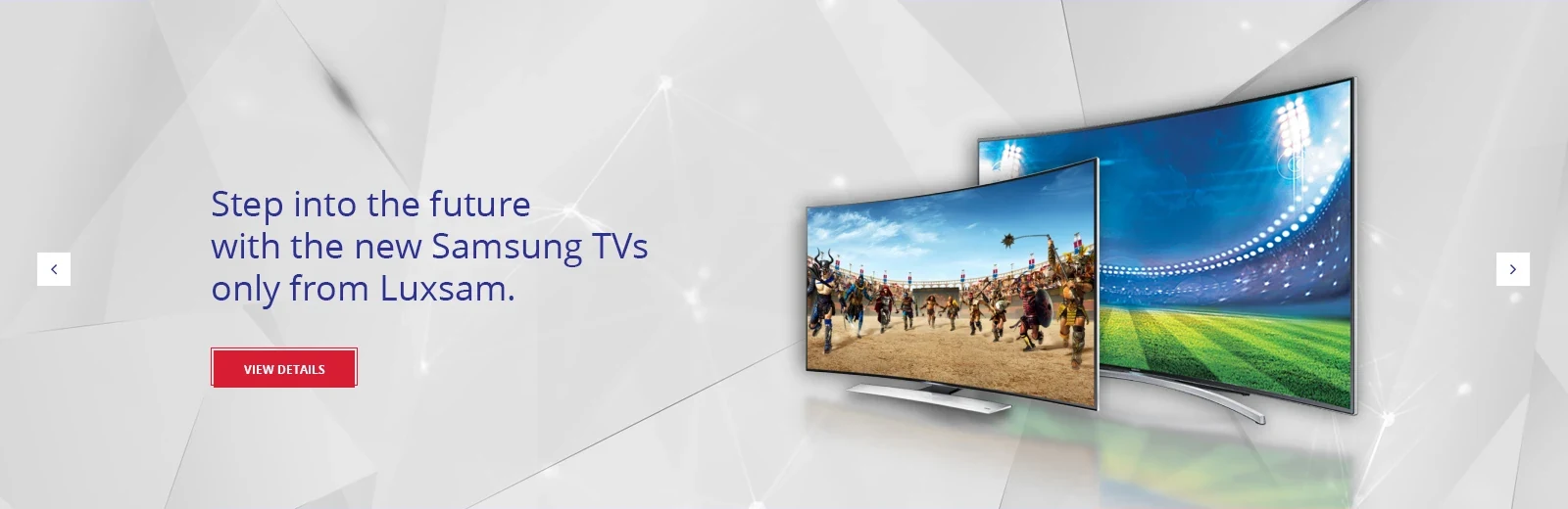
A Samsung hero with one clear next step
A light, faceted grey background lets the product stand out. The headline is set in light blue type beside a photograph of two curved Samsung TVs, with a single red View details button below it. White square arrows on both sides show that the hero is a slider.
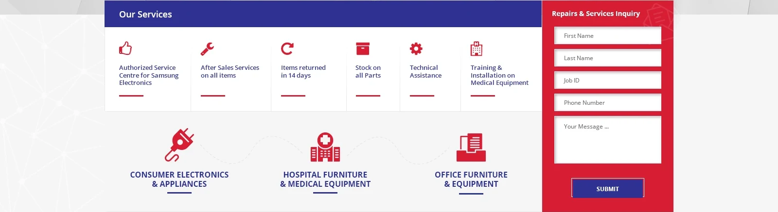
Services and a repairs form side by side
Six service highlights sit under a blue Our Services bar, each with a red icon and a short red underline. Below them, three large icons introduce the product lines: consumer electronics, hospital furniture and medical equipment, and office furniture and equipment. A red Repairs and Services Inquiry panel on the right keeps the form in view, with a blue Submit button.
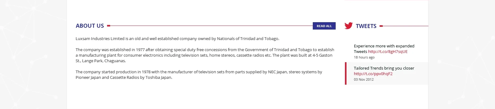
The company story next to its latest tweets
The About us heading has a red line running out to a small blue Read all button, with the company history set in a clean, readable text block beneath it. A narrower Tweets column on the right shows two recent posts, and a red bar marks the latest one.
The brand names at a glance
A single row of seven brand logos (Harloff, Magnum Electronics, Samsung, Rice Lake, Panasonic, DRE and Clinton Industries) sits on a pale grey strip, so visitors see which names are on offer without having to look for them.

A latest products carousel
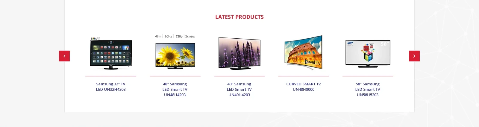
Five Samsung TVs show in a row on a clean white panel. Each has a red rule above it, with the name and model number below in blue, and red square arrows at both edges move through the rest.
A dark footer with every contact detail
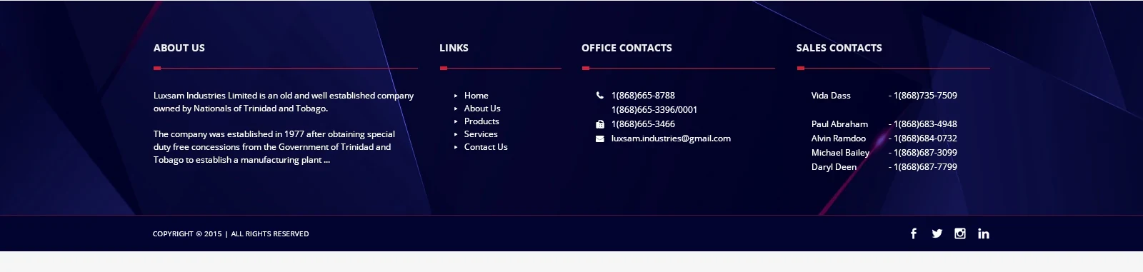
The dark navy footer has a faceted pattern and four columns: About us, Links, Office contacts and Sales contacts. Each has a white heading with a red underline, and sales contacts list a name beside each phone number so visitors can call the right person. A bottom bar carries the copyright and social icons.
Colour and type
A deep royal blue carries the header, the section titles, the product names and the submit button. Bright red marks the buttons, the icons, the underlines and the repairs inquiry panel. The page itself is white and pale grey, and the footer switches to a dark navy with a faceted pattern.
One clean sans serif is used throughout, with capitals for navigation and headings and a light weight for the large hero headline.
Want a store like this?
Tell us what you sell and we will design it, build it and launch it for one fixed price.