Nabuco
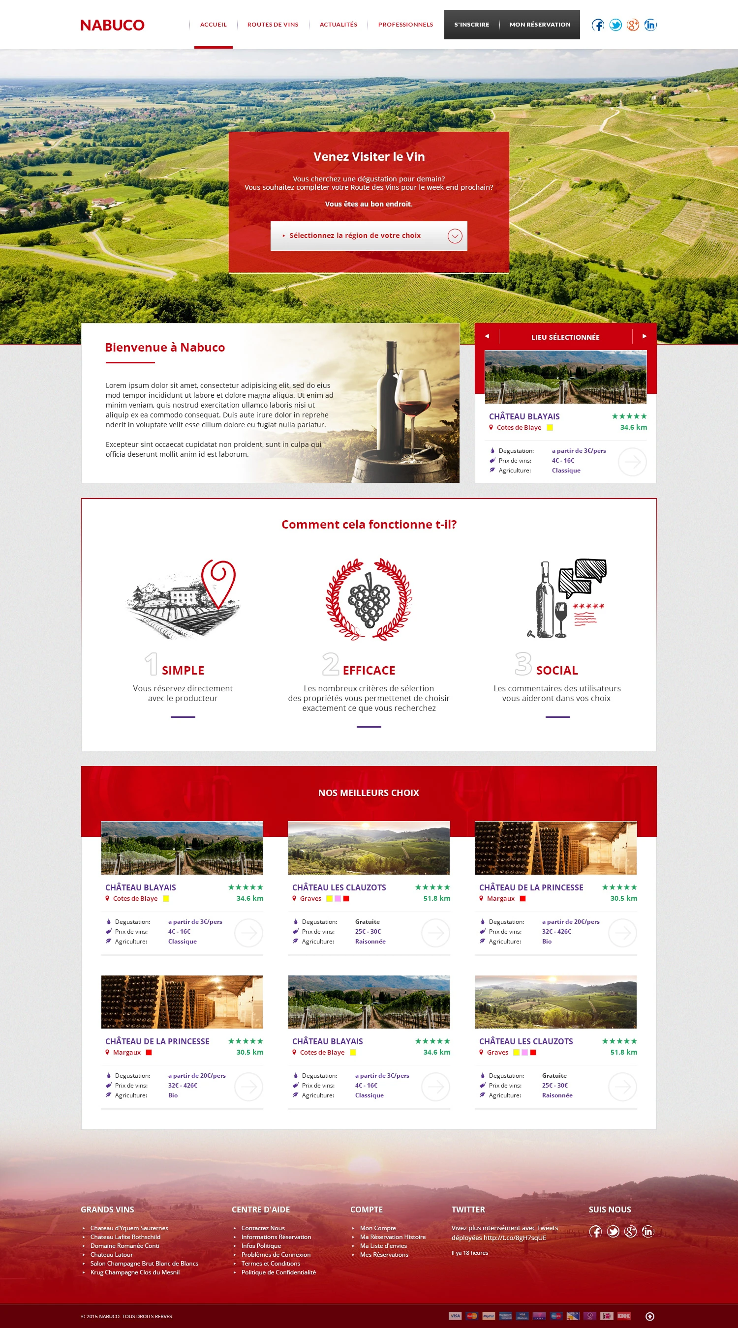
A French language website for reserving a wine tasting directly with the producer. We designed a fresh red and white site around a big vineyard photo, with a region selector, a short three point explanation, and cards for the best châteaux showing price, distance and rating.
- Client
- Nabuco
- Industry
- Wine tourism
- Specialism
- Wine tasting bookings
- Style
- Red and purple
- What we did
- Website design
The brief
Nabuco lets visitors reserve a wine tasting, or complete a wine route for the weekend, by booking directly with the producer. Each château is listed with its region, distance, tasting price, wine prices and type of farming, and visitors can rate and comment.
The design had to invite people to pick a region straight away, explain the idea in three words (simple, efficient and social), and give every château card enough detail to compare.
A white header with a dark booking block
A white bar holds the red wordmark on the left and four links in small red capitals: Home, Wine routes, News and For professionals. A red line under the active link marks the page. On the right, a dark block combines Sign up and My booking, followed by social icons.

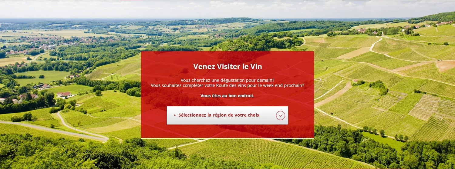
A vineyard photo with a booking prompt
A bright aerial photo of rolling vineyards fills the hero. A red box in the centre invites visitors to come and visit the wine, asks if they are looking for a tasting for tomorrow, and holds a region drop down so the search starts straight away.
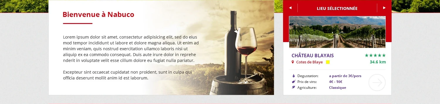
A welcome panel and a selected place
A white welcome panel on the left pairs a short intro with a wine bottle, a glass and a barrel in warm tones. On the right, a red Selected place card with arrows shows one château with a photo, its name, region, distance, a star rating and a short tasting and price summary.
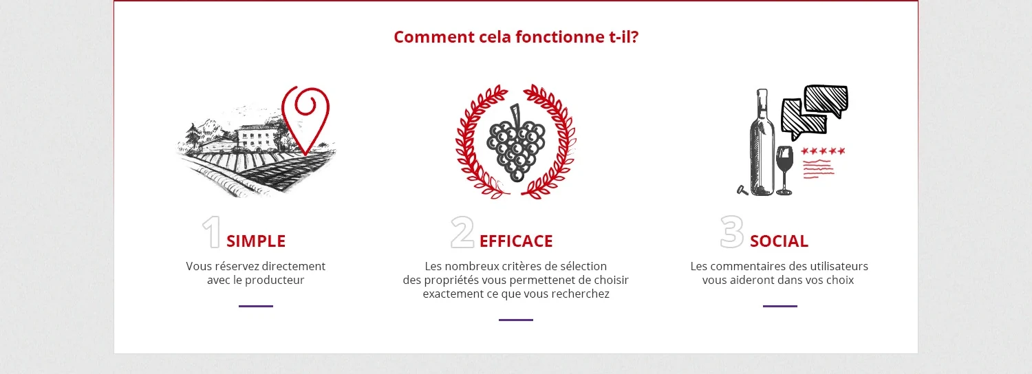
Three steps with hand drawn icons
A white box with a thin red border explains the idea in three columns: Simple, Efficient and Social. Each has a sketch style illustration, a large outlined number, a one line explanation and a short purple underline. The sketches, a vineyard with a map pin, a grape wreath and a bottle with speech bubbles, give the site a crafted feel.
Six château cards on a red header
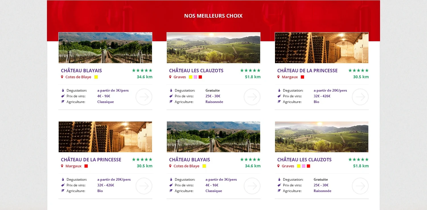
A red band titled Our best choices sits behind the top of the card grid, and six white cards follow in two rows of three. Each shows a wide photo, the château name in purple, a region with small colour squares, a green star rating, the distance in green, and three details: tasting price, wine prices and type of farming. A round outlined arrow opens the full page.
A sunset vineyard footer
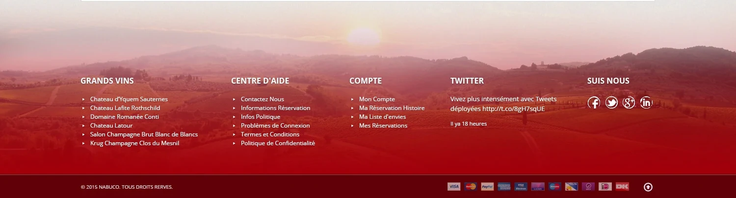
A soft red tinted photo of rolling hills at sunset sits behind five columns: Great wines, Help centre, Account, Twitter and Follow us with social icons. A dark red bar at the bottom carries the copyright, payment icons and a round arrow button.
Colour and type
A strong red leads the design: it fills the hero box, the active menu line, the headings and the best choices band. Deep purple marks the château names, the details and the short underlines, and fresh green marks the star ratings and distances. The page itself is white on a light grey textured background, so the green and gold of the photos stand out.
One clean, friendly sans serif is used throughout, with bold red headings and small capitals for navigation.
Want a store like this?
Tell us what you sell and we will design it, build it and launch it for one fixed price.