Organify
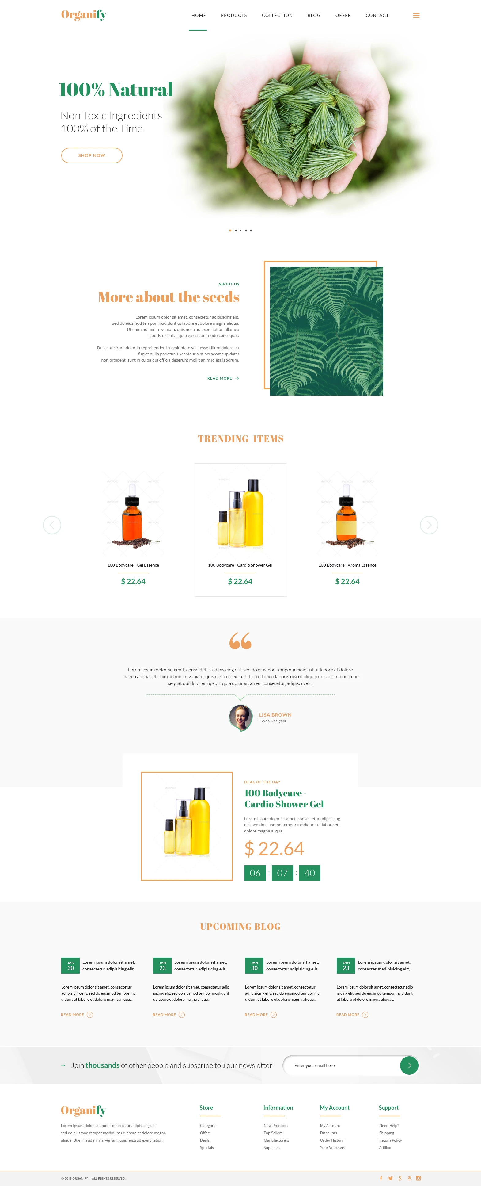
An online store for a natural bodycare brand built around one promise: 100% natural, non toxic ingredients. We designed a store to match, with a hero photograph of fresh leaves, a green and orange palette, a trending items carousel and a deal of the day with a countdown.
- Client
- Organify
- Industry
- Natural bodycare
- Specialism
- Non toxic ingredients
- Style
- Green and orange
- What we did
- Store design
The brief
Organify sells natural bodycare, from essences in dropper bottles to shower gels, under one promise: non toxic ingredients, 100% of the time.
The design had to carry that promise from the first screen, show the products without clutter, and give shoppers reasons to stay: a deal of the day, a blog and a newsletter.
A light header with a clear active link
The orange wordmark sits on the left and six links in spaced capitals sit beside it: Home, Products, Collection, Blog, Offer and Contact. A short green line under Home shows the current page, and a menu icon sits at the far right.

The promise comes first
The headline states the brand promise in bold green serif type, with one light line of support beneath it. A photograph of hands holding fresh green leaves fades softly into the white page, and one outlined Shop now button leads into the store. Five small dots under the photo show that the hero is a slider.

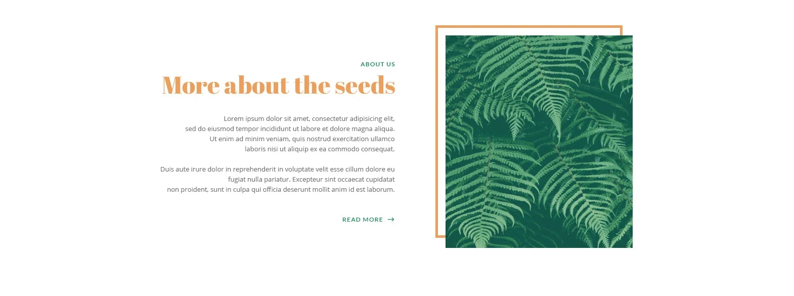
A story section with a framed photo
Copy is set right aligned beside a photograph of fern leaves. An orange outline sits offset behind the photo to give it depth, and a small green Read more link carries on to the full story.
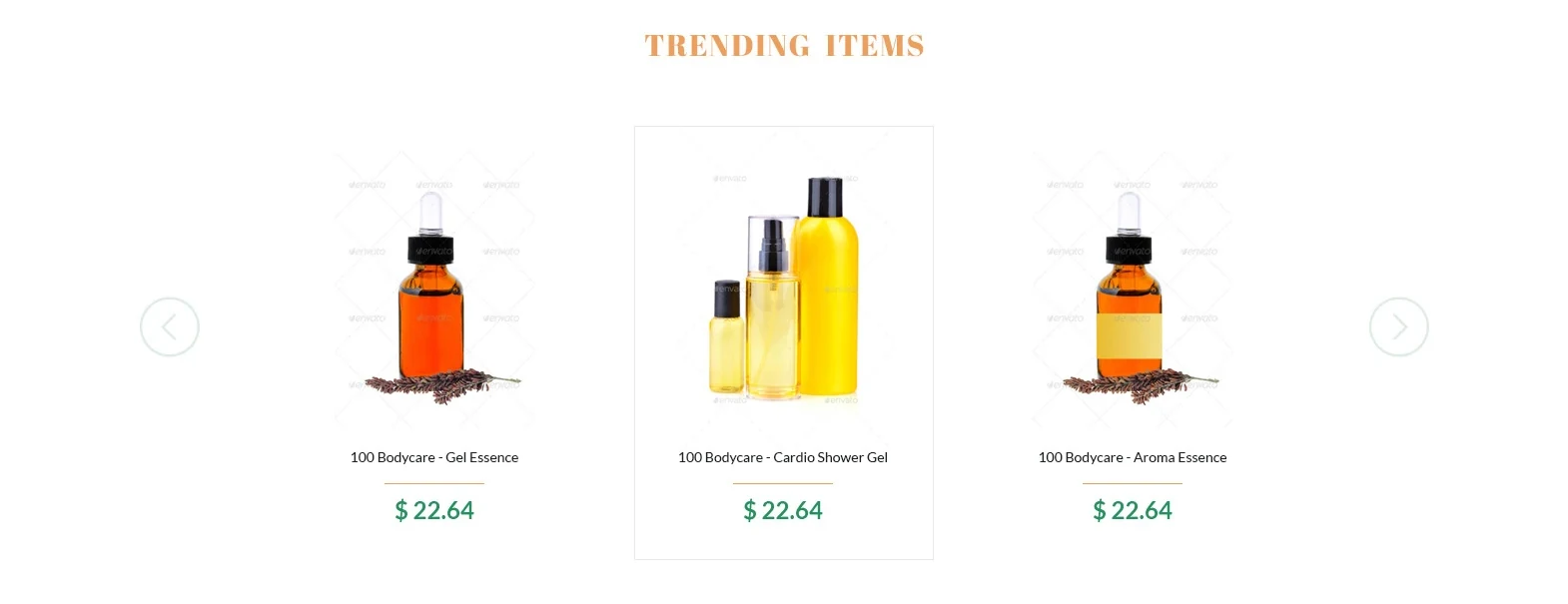
Trending items in a carousel
Three products show at once on plain white, with round arrows on both sides to move through the rest. The centre card gets a thin border so the eye lands there first, and every card keeps to a name, a short orange rule and a green price.
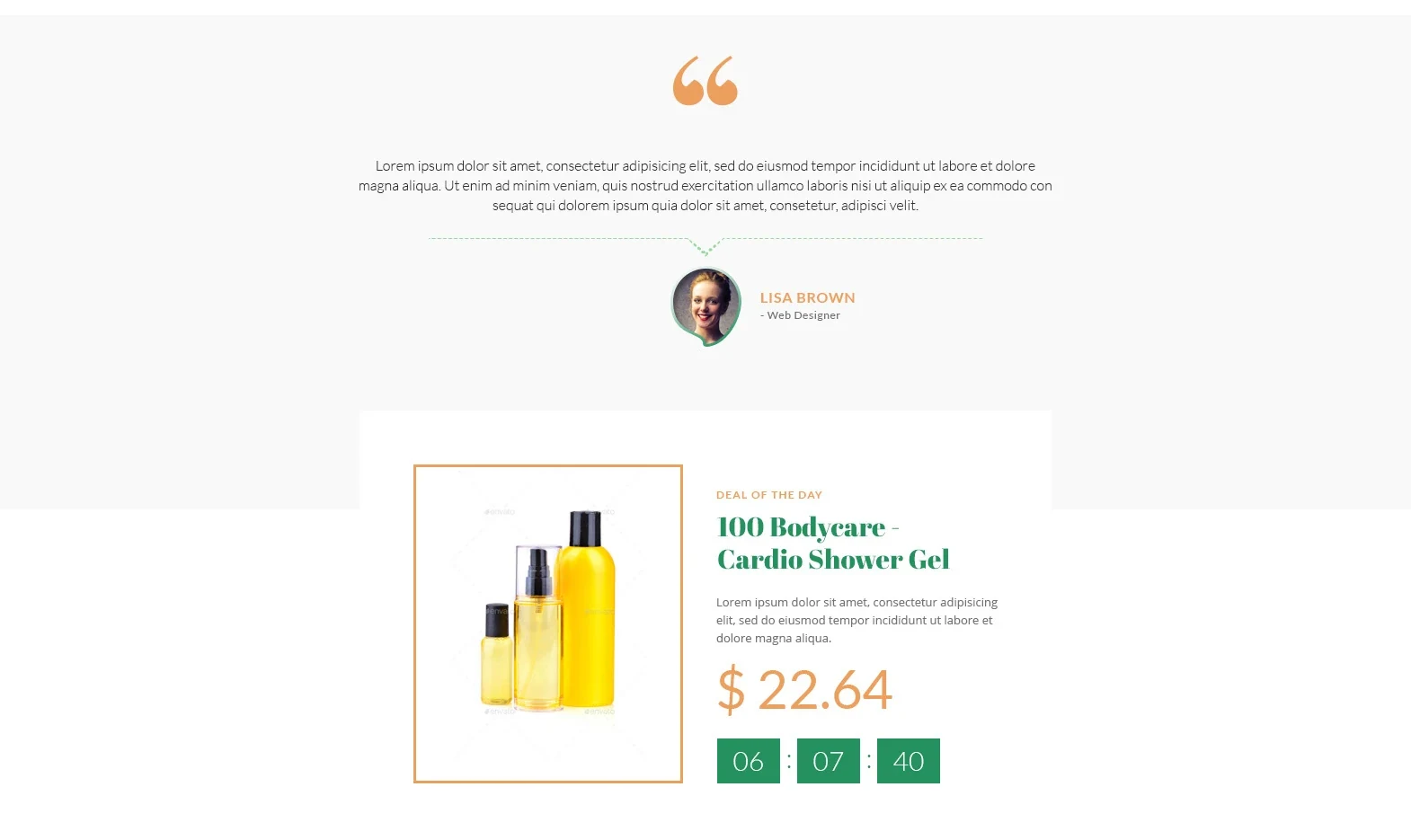
A testimonial, then a deal with a clock
A large orange quote mark, a short testimonial and a round portrait with a name and job title sit on a pale grey band. Below it, a deal of the day card breaks out of the band: the product sits in an orange frame beside its name, a large orange price and a countdown in green boxes.
Four blog cards in a row
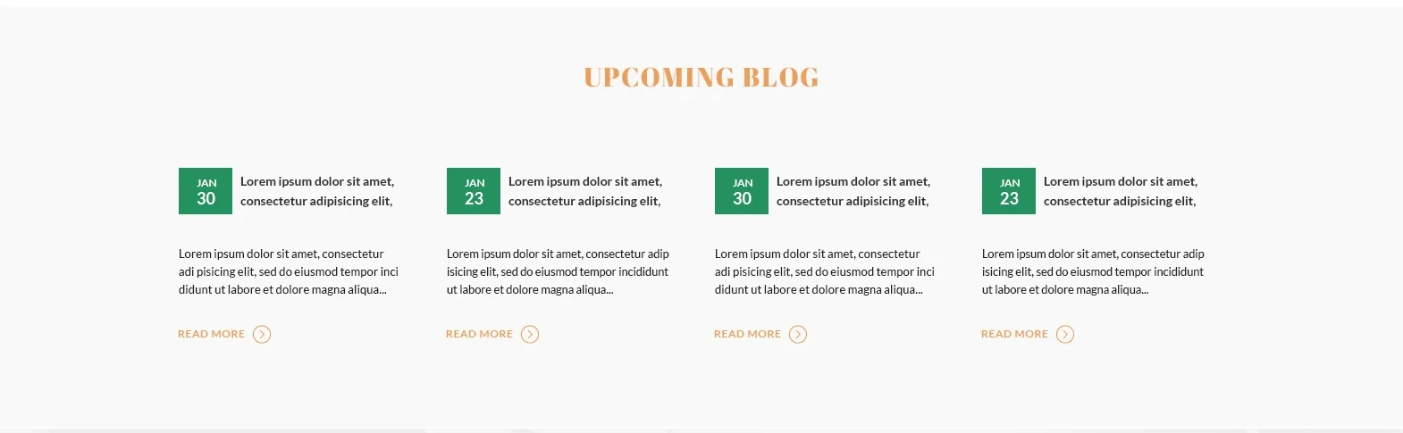
Each card starts with a green date badge beside a bold title, then a short excerpt and an orange Read more link with a round arrow. Four equal columns on a pale grey band keep the row tidy and easy to scan.
A newsletter strip and a tidy footer
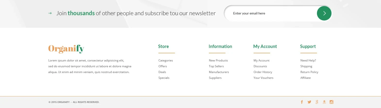
A light grey strip invites visitors to subscribe, with a rounded email field and a round green arrow button. The footer below repeats the wordmark with a short description, adds four link columns with green headings and short orange underlines, and ends with a thin orange line above the copyright and social icons.
Colour and type
Fresh green carries the headline, the prices, the date badges and the countdown. Warm orange marks the logo, the section titles, the photo frames and the deal price. The page itself is white, with pale grey bands behind the testimonial and the blog.
Headlines are set in a bold, high contrast serif. Navigation and small labels use spaced capitals, and body text and product details use a clean, light sans serif.
Want a store like this?
Tell us what you sell and we will design it, build it and launch it for one fixed price.