Westende Jewellers
An online boutique for a jewellery brand that specialises in new and vintage antique pieces, and also buys gold. We designed a store where the rings do the talking: a bold hero, one clear row of offers, and a catalogue that is easy to browse by type.
- Client
- Westende Jewellers
- Industry
- Jewellery
- Specialism
- New and vintage antique
- Platform
- Shopify
- What we did
- Design and build
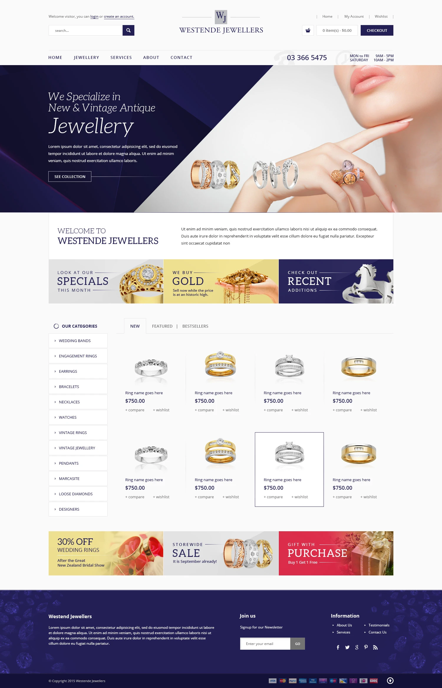
The brief
Westende Jewellers sells new and vintage antique jewellery, from wedding bands and engagement rings to watches and loose diamonds. It also buys gold.
The store had to do three jobs at once: show the pieces at their best, make a wide range easy to browse, and keep the phone number, opening hours and current offers in front of every visitor.
Contact details stay in view
The phone number and opening hours sit in the main bar beside the navigation, so a shopper deciding whether to call never has to look for them. Search, the cart total and the checkout button stay at the top of every page.

A statement for the specialism
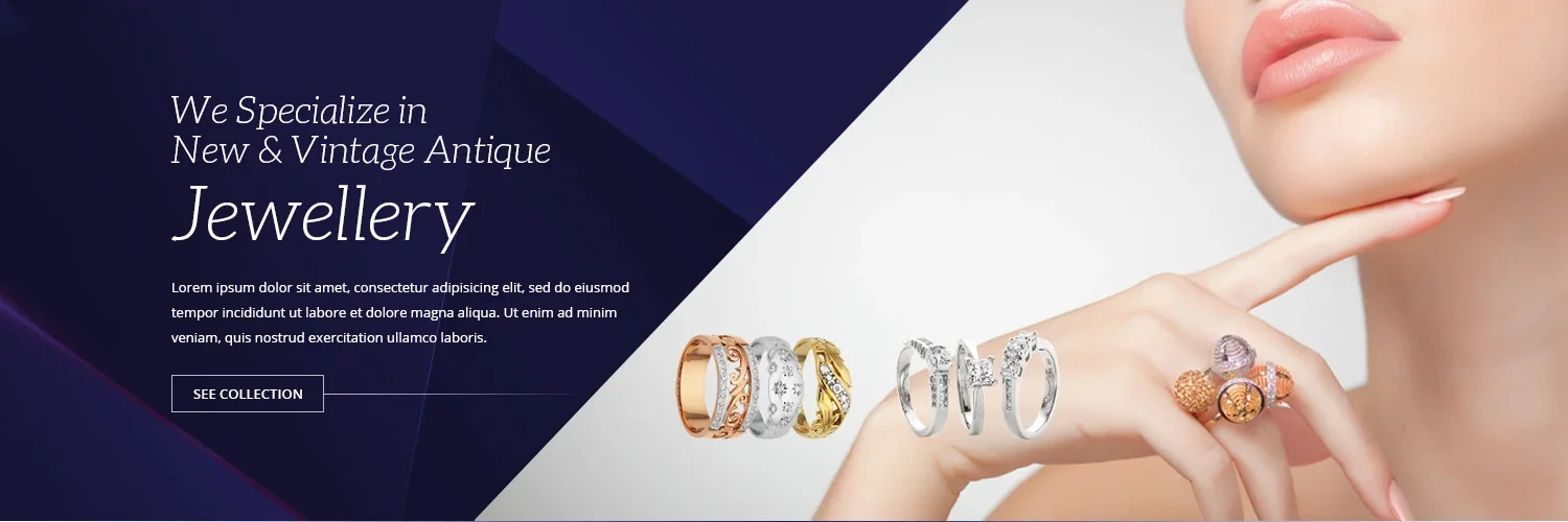
The hero says what Westende does, new and vintage antique jewellery, in a light italic serif over deep indigo. A diagonal split opens onto a photograph of rings on a hand, and a single See collection button leads into the catalogue.
Three tiles for three intents
Specials, gold buying and recent additions sit in one row under the welcome text. The tiles share one layout in three colours, so they read as a set and give the gold buying service the same weight as the products.

Browse by type, then by what is new
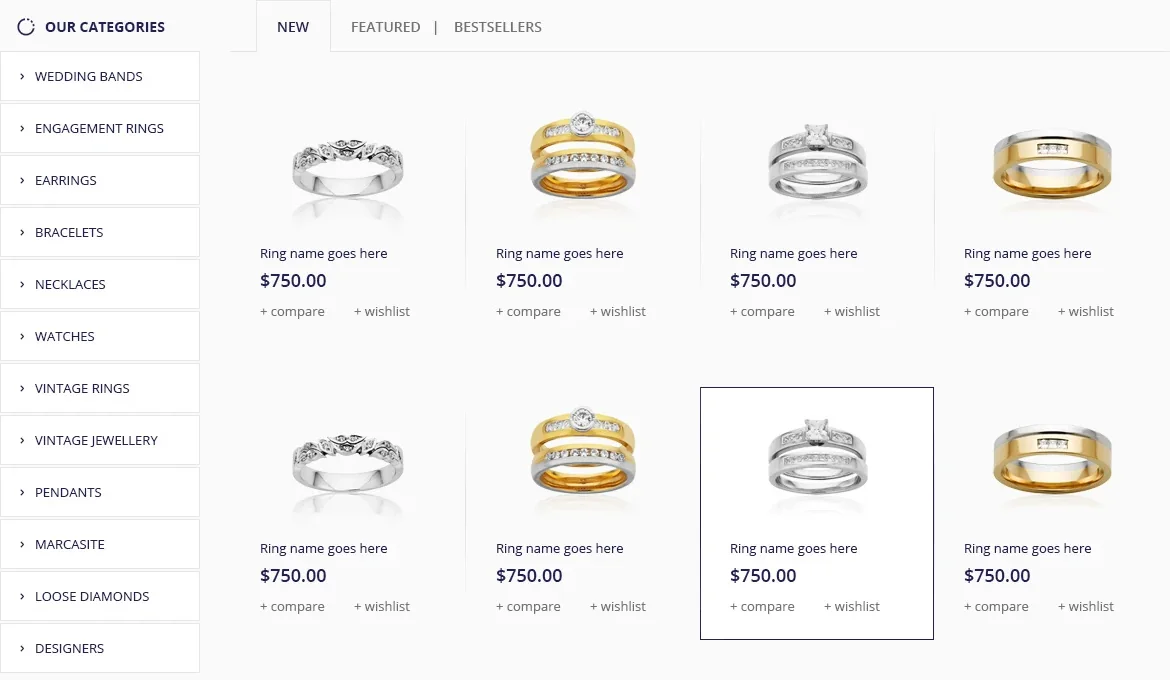
Twelve categories run down the left, from wedding bands and engagement rings to vintage jewellery, marcasite, loose diamonds and designers. New, Featured and Bestsellers tabs sit above a grid of product cards that show the name, the price, and compare and wish list links.
Seasonal offers close the page
A second row of tiles carries the current promotions: a wedding ring discount, a storewide sale and a gift with purchase. They reuse the tile style from the top of the page, so offers feel part of the design instead of banners added on top.

A footer that does some work
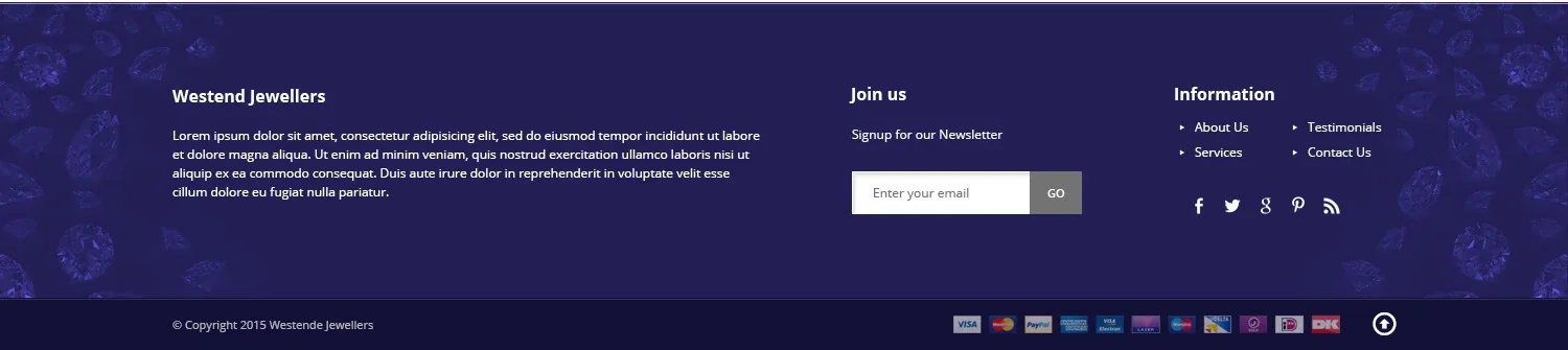
The footer returns to the deep indigo of the hero and holds a newsletter sign up, links to About Us, Testimonials, Services and Contact Us, social links and payment icons.
Colour and type
Deep indigo carries the hero, the checkout button and the footer. Warm gold marks the gold buying and wedding ring tiles, and rose red is kept for the gift offer. The page itself stays off white so the jewellery photography has room.
The hero statement is set in a light italic serif. Navigation and tile labels use spaced capitals, and product details use a clean sans serif.
The build
The store runs on Shopify, so the Westende team can add products, change prices and update offers themselves, without a developer.
Want a store like this?
Tell us what you sell and we will design it, build it and launch it for one fixed price.